Genuary 14, Aesemic
Aesemic writing is a concept I can get behind.
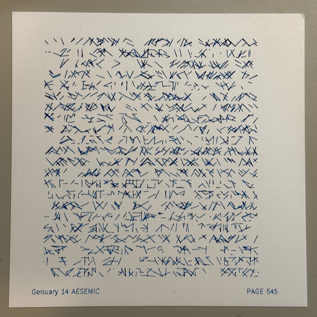
The above is my final plotter output. Below is the p5js sketch I made first. These are also on mastodon.
More on all that later, first I want to detour to my previous attempts with aesemic writing. I referenced my past attempts at aesemic in this toot last week. Lets take a closer look.
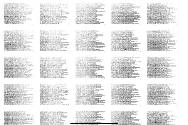
In my last go at this, I tried making cursive words with Bezier curves connected together. The control points are generated by selecting random points on a circle (from N possible positions) that moves along the word.
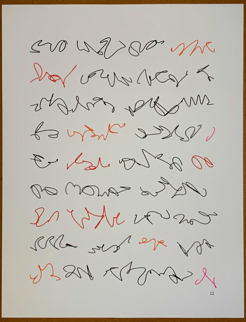
Since it only draws from a pre-determined subset of the random points on the cirlce, the words are formed from a set of letters. An alphabet. You can see some repeated patterns in the page of writing above. Additionally, I added some sloppiness terms, so the letters aren’t identical each time they’re drawn. It’s supposed to represent handwriting instead of printed text.
I like the loopyness and fluidity of the forms, but they don’t really look like writing to me. I thought maybe I had just chosen a badly formed alphabet? So I made some more. Each row is an alphabet.
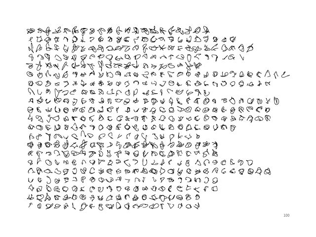
I made lots of alphabets.
It’s overwhelming. It’s not sustainable. Yet I persistend and picked a few to plot out on small trading cards to get a feel for them.
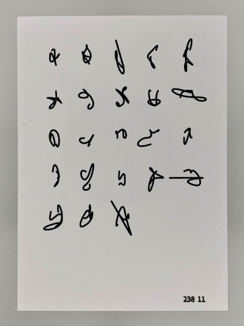
I like these. A lot of them look like the letter “y”. They sort of go together, same style. But maybe that’s a problem. Not enough to distinguish the different letters. Also, no sample words to see how they look.
I sort of lost steam on it at this point when I was last working on it.
Returning to the ones I made today, I had a different goal, and a different inspiration. The idea today came from one of the figures in the second edition of the Processing book (p451, if you want to see). All straight lines.
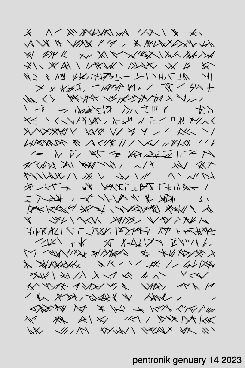
In today’s asemic writing, it’s based on a 3x3 grid, and lines are drawn between the points, plus a bit of noise to loosen it up. There are two types, one doesn’t allow the x or y to be the same- it’s all diagonal. The other type of letter allows x or y to be the same but not both- vertical and horizontal lines are now allowed but no dots. This is what’s in the second figure above, that I made with p5js. Some rows are one letter type, and others are the other. Each row has it’s own amount of noise. I played with increasing the noise as the page does down, schotter style, but didn’t like it all that much.
I’m pretty happy with that p5js output, for half an hour’s effort. But I’m more of a plotter than a processer, so I translated it into my own python code to generate something similar. Nominally it should be identical.
Easier said than done.
I think I’ll have to do a lot more fiddling to figure out what is different here, and fiddling isn’t all that deterministic of a process. So instead, I’m going to leave here and stew on what lessons, exactly, I should be learning from this about my own process, and what I think makes good aesemic output.
Some things for me to think about:
- How can I get the iteration time down even more in my python code and rendering engine. Further friction reduction is needed.
- What code design decisions can I make to shrink the gap between what I sketch out in p5js vs what I re-implement in my engine? Re-implement is already kind of bleck.
- Try fewer lines on the current output.
- Pay closer attention to the feel of the resulting page, there’s not much different between the outputs but one sure looks more like writing than the other. Follow that.
- Maybe a mix of the diagonal and square lettes in the same word would help?
‘Till next time.
And, as usual, see genuary.art for the rest of the genuary prompts.